- Home
- Blog
10 Types of Charts: Data Insights with Visualizations

TABLE OF CONTENT
What’s that one thing available in abundance, but you can’t make even the slightest sense of it unless you have it meticulously arranged? Oh yes, if your guess is data, you’re spot on! Now again, how do we perfectly lay it on the table? One popular way is using different types of charts and graphs!
Surprisingly, that’s precisely what we are going to explore right now! What a coincidence!
In this blog, we will look into four categories of charts.
- Basic Charts
- Specialty Charts
- Advanced Charts
- Combination Charts
Let’s crack the code!
But, before that, we need to understand…
The Importance of Visualizing Data
Seeing is understanding when it comes to the world of numbers. Why?
Well, because looking at charts and graphs makes data easy. Imagine staring at a bunch of numbers—it’s like decoding a secret language.
But with visuals, it’s like a map guiding you through a data adventure. That’s why visualizing data is crucial. Let’s add a few more reasons:
1. Clarity in Complexity
Have you ever tried solving a puzzle with missing pieces? Data can feel like that—complex and confusing. But introducing visuals is like turning chaos into clarity. Visuals simplify the mess, revealing patterns and trends that were once hidden. It’s your data roadmap, making navigation a breeze.
2. Informed Decision-Making
Every day, we make choices, big and small. But how do you ensure they’re the right ones?
Visualized data is your secret weapon. It transforms decision-making from a guessing game into a strategic endeavor. It’s like having a crystal ball, shedding light on opportunities and forewarning of potential challenges.
3. Spotting Trends and Anomalies
Numbers can be deceiving. It can hide crucial trends and anomalies. But visuals are like turning on a light in a dark data-filled room. Suddenly, patterns emerge, and anomalies become apparent. It acts as a spotlight, revealing the true story behind the numbers.
4. Efficient Communication
Have you ever tried explaining a complex report using just words? Tricky, right?
Visuals make communication efficient, serving as a common language for teams. They connect everyone on the same visual page, making discussions clear and concise.
5. Universal Understanding
Words may differ, but visuals are a universal communicator. They transcend language barriers, creating a shared understanding. It’s like speaking a language everyone in the room comprehends.
So, it is all about making sense. Am I making sense?
Now since that’s covered, let’s look at the different types of charts that help you make the most of your data.
Read More: IoT Data Collection and Visualization: How to Use it to Understand Big Data
10 Unique Types of Charts
Just as data are abundant, there are many choices for types of charts.
1. Vertical Bar Chart
A vertical bar chart visualizes data using vertical bars, each corresponding to different categories or groups. The length of each bar reflects the quantity or value it represents. This type of chart is particularly effective in comparing values across distinct categories.
But hold up! I will talk about the most effective and essential ones I have used while customizing my dashboards with.
2. Line Chart
A line chart is like a visual storyteller for data, showing how things change over time. Picture a smooth line gliding across a graph, telling the tale of value ups and downs. It’s like a timeline that reveals trends, making it perfect for tracking changes and spotting patterns in information.
3. Area Chart
An area chart is a visual representation of data that builds upon the concept of a line chart. It not only showcases trends over time but also emphasizes the cumulative total of a variable

Oh, wait, don’t just take my word for it; let the facts speak for themselves!
Basic Types of Charts
Basic charts are like the go-to tools—simple yet strong. They lay the foundation for understanding data quickly.
Think of them as the starting point before you dive into the complexity. Let’s look at each primary chart type to see how they work.
1. Vertical Bar Chart
A vertical bar chart visualizes data using vertical bars, each corresponding to different categories or groups. The length of each bar reflects the quantity or value it represents. This type of chart is particularly effective in comparing values across distinct categories.
Key Features
- Clarity in Comparisons: They provide a clear and straightforward way to compare values between different groups or categories.
- Ease of Reading: The simplicity makes them easy to read and understand. Each bar stands as a distinct visual entity.
- Versatility: It adapts well to showcasing both small and large datasets.
- Visual Hierarchy: You can quickly identify highs and lows among the represented values.
- Space Efficiency: Vertical bar charts are space-efficient. They offer a compact yet comprehensive representation of data.
Where Can It Be Used?
Let’s look at this with an example.
Imagine a post-purchase survey where customers rate their satisfaction levels. A vertical bar chart can visually represent the distribution of ratings, making it easy to identify the most and least satisfied segments.
A vertical bar chart can effectively display the distribution of responses. It enables stakeholders to grasp the overall sentiment and identify areas for improvement quickly.
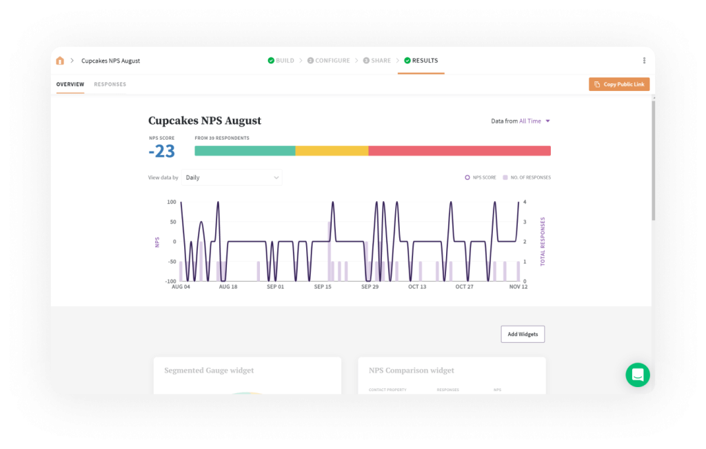
2. Line Chart
A line chart is like a visual storyteller for data, showing how things change over time. Picture a smooth line gliding across a graph, telling the tale of value ups and downs. It’s like a timeline that reveals trends, making it perfect for tracking changes and spotting patterns in information.